> Label design
Tóthborok Label design
> Challange
„Ecséd is a small settlement at the foot of Mount Mátra, surrounded by a beautiful hilltop and divided by a gentle stream. The picturesque vineyards around have been cultivated since the 15th century. This small village is the home to our family winery.”
The cooperation with Tóthborok Winery began in 2019: at that time, we were comissioned with the branding and the design of their first generation wine labels. Since then - as a result of our good relationship and mutual trust - we have been entrusted with several graphic design and printing preparation of numerous printed and promotional materials.
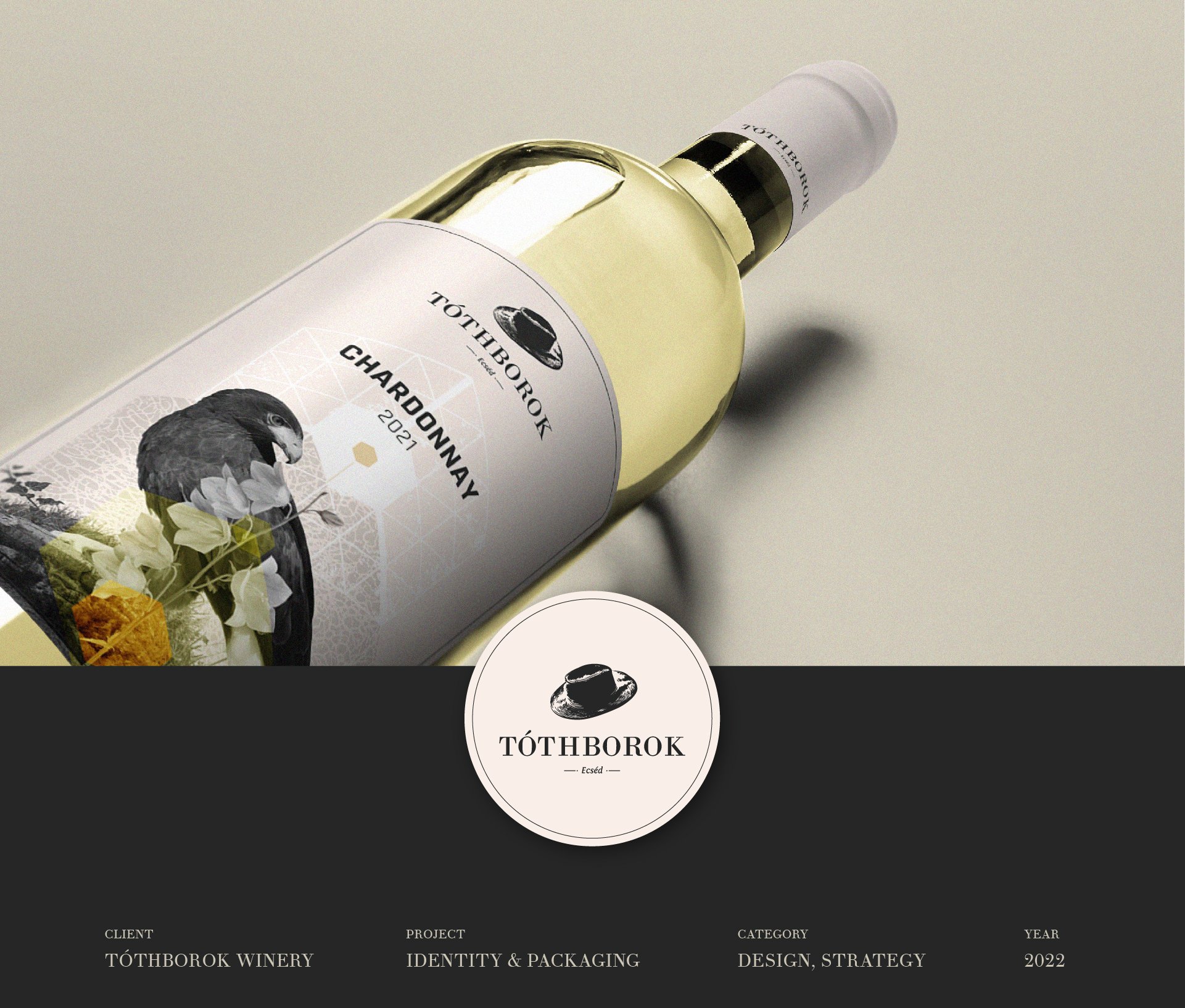
After the re-branding process, the Winery developed even further, and their wine sortiment increased significantly. This year they found the time to replace the old bottle designs and move forward with a new look.
> Outcome
By renewing the wine label designs, our common goal was to present them in a premium look that emphasizes the uniqueness of the wines, true to their quality. The colorful and bold labels of the past have been replaced by the new elegant black-and-white, but color-coded design for each type of wine.
We selected animals that best fit the personality and character of the wines, mainly from the fauna of the surrounding area of Mount Mátra. The pattern of the labels is elaborate and yet clean at the same time. It contains both organic and geometric elements. The natural elements layered on top of each other, the animal and a properly selected color code reflect the mood of the specific wine and visually complement the particular wine's taste.
At the 2022 Sziget Festival, Tóthborok was represented itself, so many islanders could enjoy their cooling drinks. We also visited to take photos, and we have to say that these pictures absolutely reflect the atmosphere of the Island!