> Branding, Label design
Tóthborok Winery
> Challenge
When we rebrand, we always think, that storytelling is one of the main aspects. We believe in maintaining the continuity of an identity is of paramount importance.
The roots of the history of the Tóthborok (Tóth wine) goes back to Mihály Maksa. He was the grandfather of László Tóth ( the current head of the winery ), who in the early 1900s was the vicar of a winery with an English interest with a capital of 2 million vines.
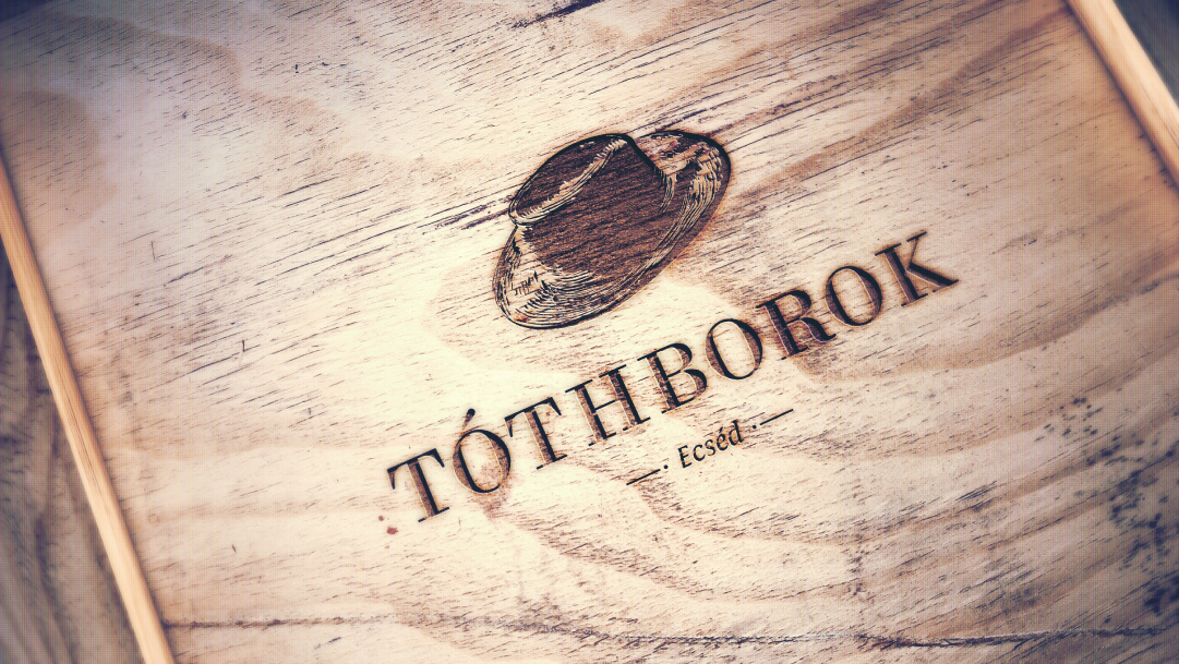
The design of the logo was based on an old shot of him, which also formed the label of the previous image. Since this image was alive in the eyes of the winery’s guests and customers as the visual identity of the Tóth wines, we defined the iconic hat shown in the old photo as the basic logo.
> Outcome
The hat symbol embodies the founder of the winery, Mihály Maksa. In addition to all this, it can be interpreted as an archetype of individuality and family traditions. With its simple, cartoonish depiction, we tried to emphasize the family and handicraft character.
In addition to the comprehensive brand design, Tóthborok Winery also commissioned us with the label design of seven types of wines.
With the help of the new visual identity and label design, we hope that more and more people will become familiar with and love the ‘wine with a hat’.


