> Branding, Website
Thinkvise | Get perspective
> Challenge
Thinkvise’s business-oriented legal consulting team has entrusted us with creating their visual identity. As a part of this, we designed a logo, printing materials (business card, publication, letterhead, seal etc.) and a website for them.
The logo brings the company’s motto “get perspective” to life.
In their work, the team of thinkvise strives to present all possible perspectives to its clients in a non-traditional way, to provide a good insight into the most possible outcomes of legal decisions decisions and by this, contributing to the success of their business partners.
> Outcome
The 3 lines embody the three axes of the coordinate system, which is suitable for describing the space, also symbolize guidance.
During the design process, we wanted to show this perception by visually mapping the 3 dimensions, in order to strengthen the base motif of the logo and its addition, an isometrically depicted cube which also appears as a pattern.
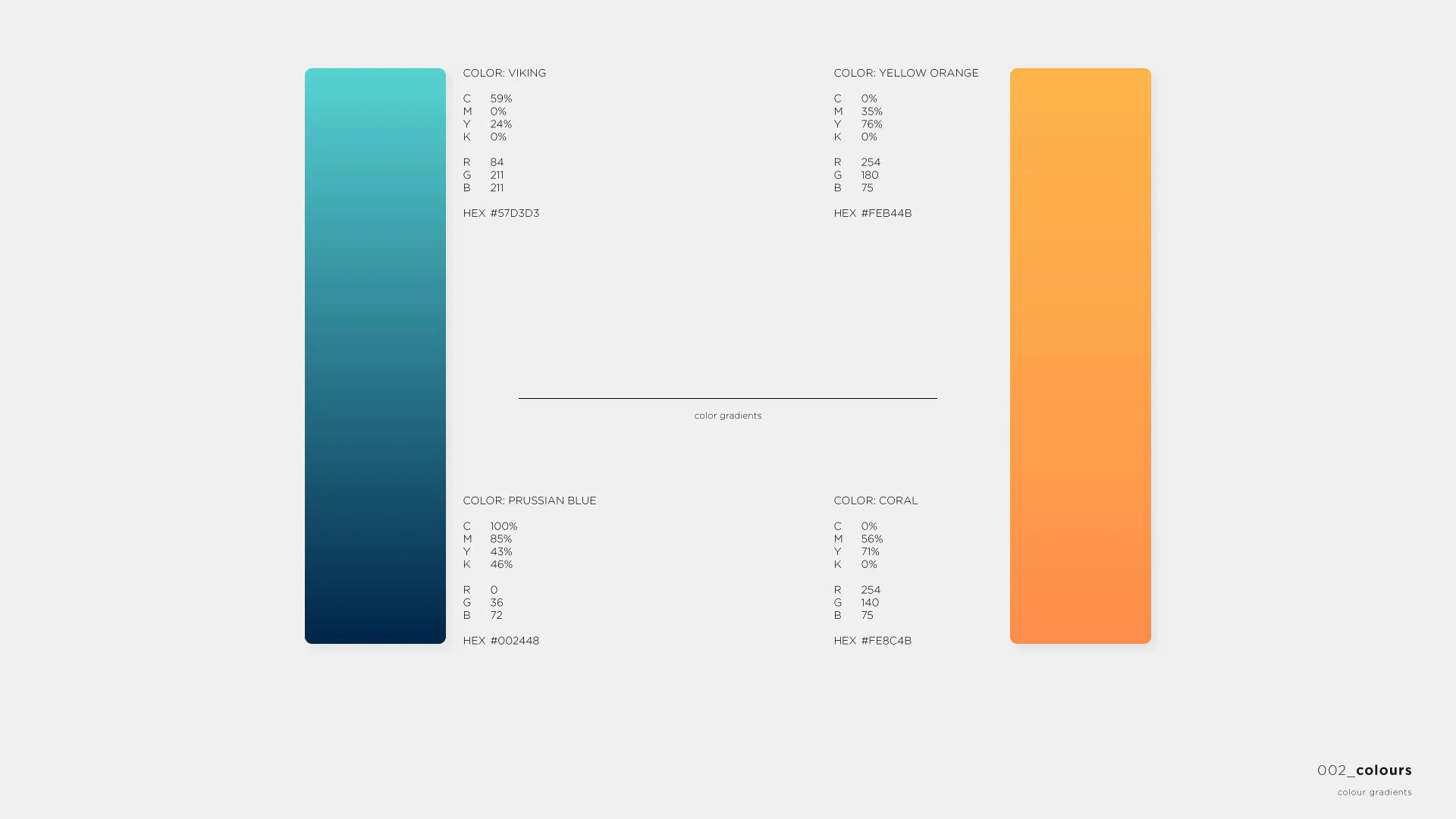
After designing the logo and the basic patterns, choosing the right primary and secondary colors and fonts, a photoshoot followed, then we used them to create their webpage.
When we started to design their website, we tried to emphasize a simple yet characteristic appearance and also to highlight the advantages of complementary colors.
Client:
Thinkvise
Website:
Contributing partner:
Kategória:
Brand design, Printing graphics, Photography, Web design, Web development


