> Complex branding & website
Netopgraf - branding & website
> Challenge
The project started out as a simple request for redesigning the logo of the company’s main product & service Netopgraf.
Netopgraf is in fact a collection of services, software & solutions provided by this IT company.
As the visual identity of Netopgraf hasn’t changed throughout the years it couldn’t statisfy the expectations of the company regarding marketing and sales aspects.
The company's visual identity was designed back in around 2010. The Netopgraf team at first couldn’t define what their problem was with the company's look, except for the fact that they knew it was somehow outdated.
Here we came in picture. We offered them a one-on-one meeting to discuss the problems, identify the painpoints and draw out a plan for solving their issues.
> Outcome
This project is a showcase for a complex and intricate brand building process.
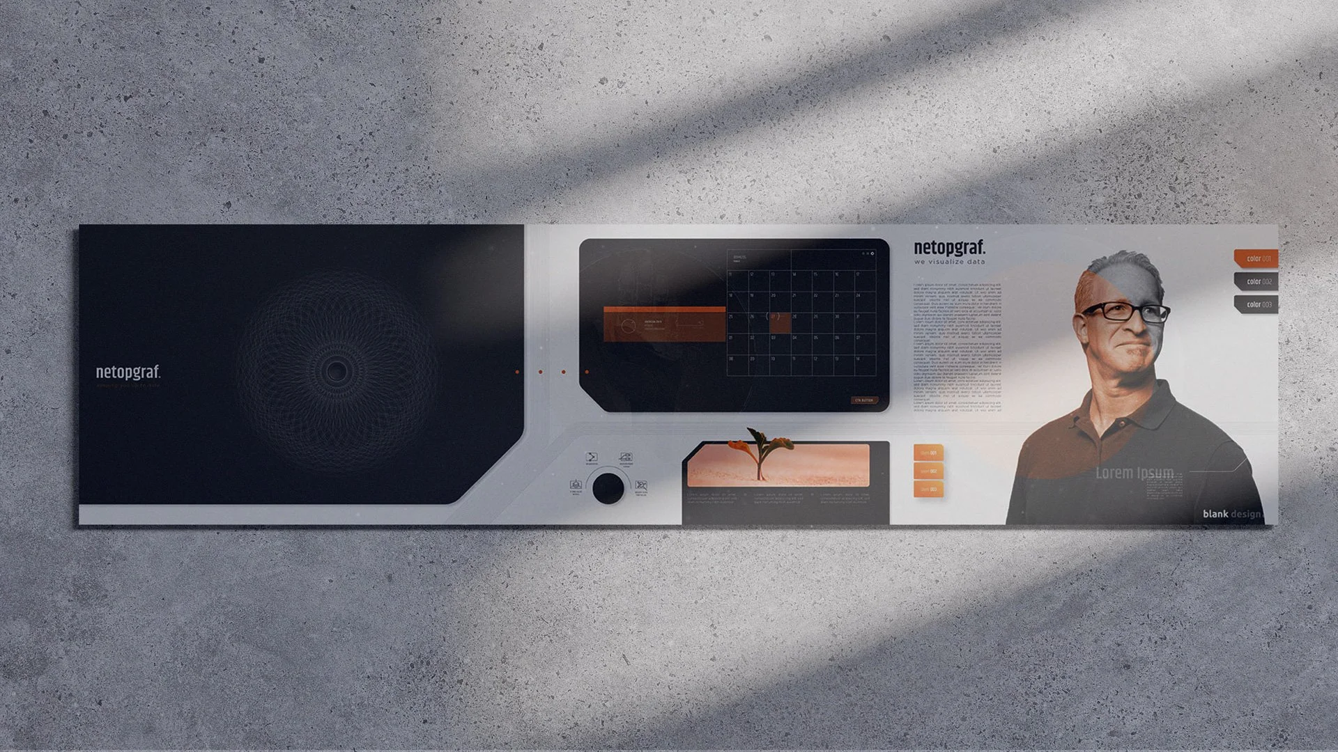
Netopgraf rebranding yielded a new logo and visual identity, a significant amount of graphic design assets, printed & digital elements, a complex design system & highly user-friendly website with many additional know-how increasing brand value and helping Netopgraf reach more clients in the IT sector.
We did:
Stylescapes | Logo | Typography system | Color system | Custom, multipurpose graphic design elements | Presentation template | Visual Identity Guidelines | Notebook | Business cards | Brochure | Envelope | Letterhead | Folder | Clothing | Complex, multilayered icon set for website & software UI | Customized illustrations & figures | Animations ( character & logo reveal ) | Photoshooting | Webdesign elements | Design System | Figma prototype for website | Website
Partner:
web development
Category:
Branding, Webdesign, Web development, Graphic design, Animation
2022


001
the starting point
The project started out as a simple request for redesigning the logo of the company’s main product & service Netopgraf.
Netopgraf is in fact a collection of services, software & solutions provided by this IT company.
The company's visual identity was designed back in around 2010. The Netopgraf team at first couldn’t define what their problem was with the company's look, except for the fact that they knew it was somehow outdated.
Here we came in picture. We offered them a one-on-one meeting to discuss the problems, identify the painpoints and draw out a plan for solving their issues.

002
branding workshop
As we do not believe in creating anything without examining its source, its basic principles, we asked Netopgraf to take their time, and fill out a Branding Questionnaire [ replacing our Branding Workshop because of the ongoing Covid situation ] that helps them gain a greater panorama of their own brand as it is now, and what’s possible for it in the future.

003
brand definition
As a result of the Branding Workshop we could create a highly precise Brand Definition perfectly describing the expected gut feeling of a future customer or client. Netopgraf’s Brand Definition (from the formerly defined brand values & attributes) turned out to be: Clean Flow. That is the definition that needed to be translated to visual language.

004
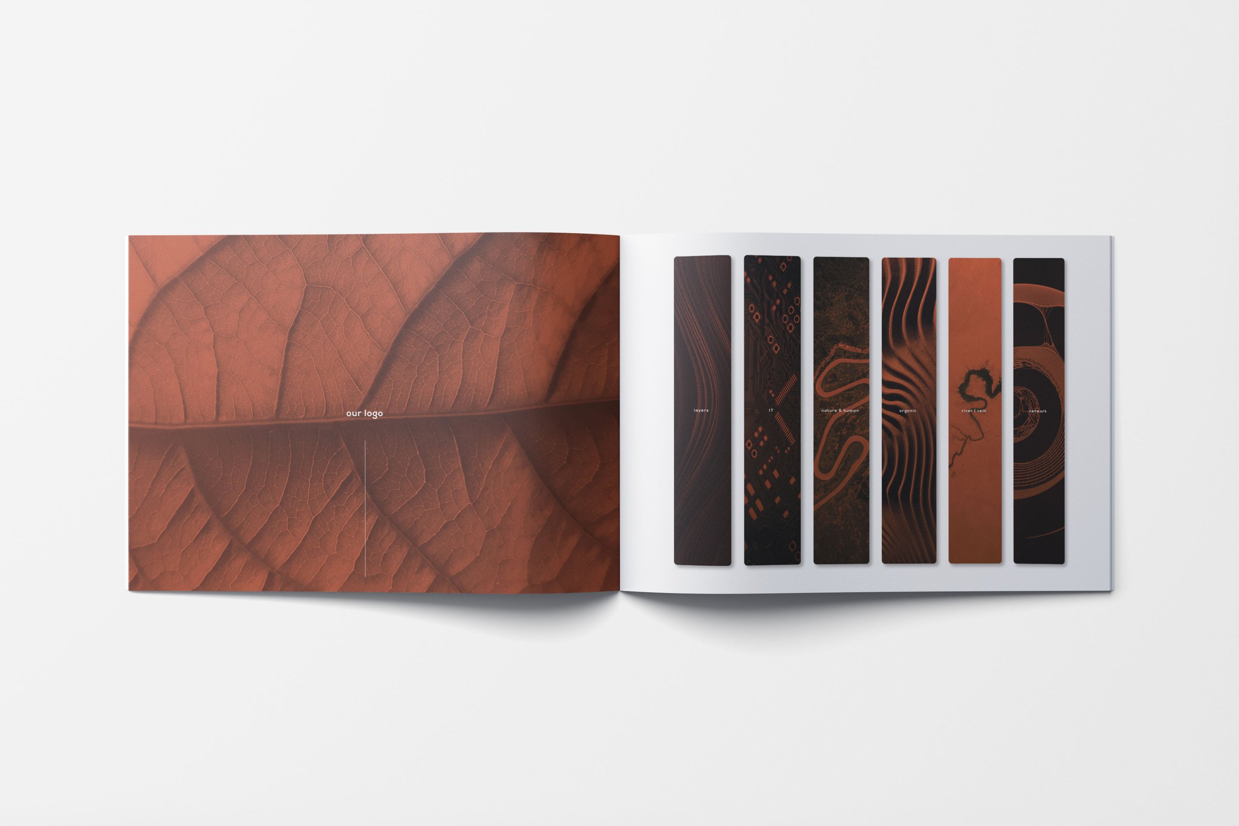
stylescape
After we discussed the Branding Questionnaire step-by-step, the Blank Design team got down to work to produce 3 variations of Stylescapes as a first step for the rebranding process.
Carefully chosen imagery, some custom graphic design assets, initial/primitive buttons, geometric elements, harmonic colorpalettes, experimenting with typography led us to a visual essence of the message Netopgraf needed to see represented in their brand.
005
logo design
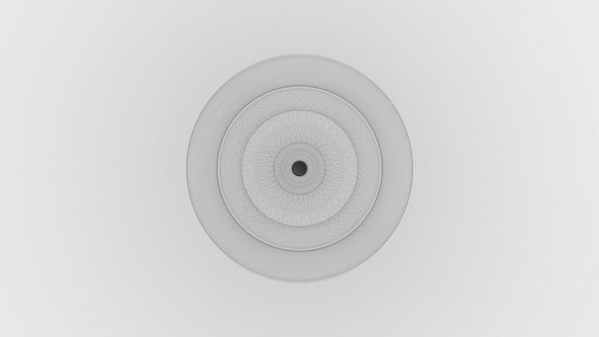
Designing the new logo for Netopgraf was not an easy mission because the old one was pretty much outdated and needed a powerful facelift.
As we like consistency, but not really had anything on our hands to work with, we only kept the approach to use a typographic emblem with a twist of planting some visual meaning into the letter ‘N’.
The emblem symbolizes flow, integrity, complexity but also provides a basis for association to nature, an organic approach and the visible connection between natural and human-made systems. Its shape can represent waves or stream, as well as electric wires showing the interconnectivity of IT devices.

006
visual identity guidebook
After two rounds of iteration, refinement and adjustments to the final look of Netopgraf's new logo, we expanded the initial stylescape and defined the appropriate color & typography system for the visual identity. We defined the rules and prohibitions for logo use, created several generative, geometric patterns and summarized all these information into a tasteful but reasonably functional visual identity guidebook.


007
stationery & printables
We designed high quality brochures, one pagers that perfectly support sales processes, also building brand awareness and trust. We believe that each and every piece of carefully designed asset gives a bit to the whole, making potential customers not only recognize, but remember a brand we build.


008
generative design elements
In this project the custom-made graphic design assets played a significant role. The design team found that this visual language is the most capable of representing the subconscious associations for those physical and cloud based connections between the elements of the IT infrastructure. High-tech, yet organic portrayal of the network mapping, visualization & documentation services.


009
mutipurpose icon set
This icon set was totally custom-made to meet the expectations and needs of Netopgraf. First the design team defined the basic rules and a framework for icon construction, than with some rounds of iteration created a multi layered, highly customisable icon set with primary, secondary and tertiary colors both for web and software user interface use.


010
customized illustrations
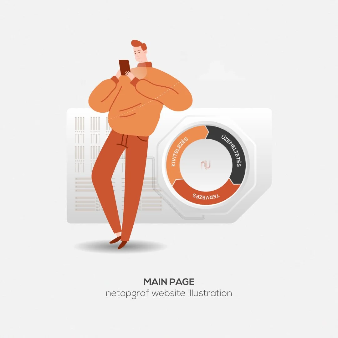
In order to make the heavy content more digestible, we decided to bring in some playfulness in the form of flat design human characters. These characters brake the monotonic rhythm of the website, and also give anchor points for orientation. In fact their role is to counterweight the over-regulated IT world and give a humble and more human approach to the subject.


011
responsive design
For the perfect user experience, we designed all the graphic elements for the website in multiple aspect ratios & arrangements. As responsivity is a minimum requirement for the sites we design, we payed great attention to all the details. Our goal was to keep the general look & feel of the website clean, simple not to draw away the attention from the content, yet make it visually appealing.


012
additional assets
Throughout the branding process we always design some items, that are in fact accessories to the most needed items used by the company. These assets can raise brand awareness and increase the value of the brand. Some complementary objects and animation below.


013
credits
Branding, Visual Identity & Graphic Design, Video, Animation - Lengyel Anna, Csizmazia András
Project Management, Prototyping - Gábor Zöldhegyi
Web Development - Gergő Káposzta, Máté Varholik
Photography - Ábel Kondics
Website design: Blank Design
Web development: Kifli Technologies

014
special thanks
A huge thanks to the whole Netopgraf team for trusting in us, especially:
Cecília Rácz, Péter Hegedűs, Gergő Hegedűs, Antónia Dohán