> Webdesign, Web development
Boho Home Design website
> Challenge
Our client, Kata Majoros, approached us with her already existing logo and lots of ideas to make her old dream come true having a website for her interior design business. Her enthusiasm also transfered on us, so after the first meeting we already knew what kind of website she needed.
We aimed to build a one-page website, the point of which was to channel visitors to the bottom of the page, to the CTA section. In addition, we have included several trust-building sections, such as the 'Works' and 'About Me' sections, where future customers can learn more about Kata's outstanding works so far and her design approach.
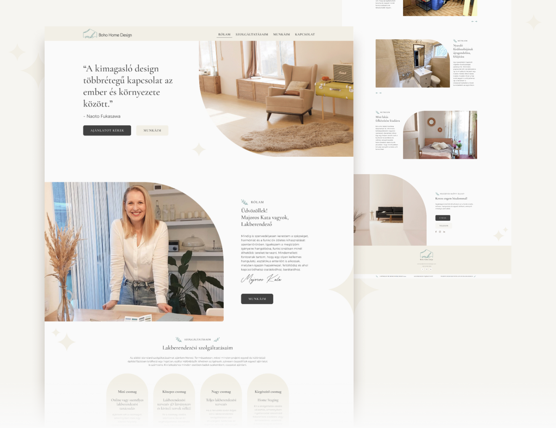
> Outcome
The website visually represents a pastelly, clean and feminine direction. We applied the 60-30-10 rule when using color system. We integrated the existing logo into the entire look of the website. We took the ’laurel’ symbol from the logo and used it as a recurring element to highlight the subheadings on the page. We have placed stylized 'glitter' symbols in the background, which are also echoed throughout the site in smaller and larger sizes.
Overall, it can be said that not only an aesthetic, but also a highly functional website from the UX-UI point of view was created.